Visual assets in digital product design often force a difficult choice. You either burn your budget hiring a custom illustrator to build a cohesive identity, or you settle for scattered stock assets. The latter usually leaves your product looking like a Frankenstein monster of mismatched styles.
Product teams and marketers face a tough question: can off-the-shelf illustration libraries actually support a coherent brand system? Can a subscription replace the nuance of a dedicated artist? Ouch, the illustration arm of Icons8, attempts to answer this. It focuses less on individual "stock photos" and more on comprehensive design systems.
I’ve used Ouch alongside other asset libraries for UI prototyping and content marketing. It offers a distinct approach to the "build vs. buy" dilemma. The platform emphasizes style consistency across thousands of assets. This helps teams maintain visual continuity from a landing page down to the 404 error screen.
This consistency does more than improve aesthetics. It strengthens on-page SEO signals by reinforcing brand recognition, reducing bounce rates, and increasing time on site - behavioral metrics that indirectly support search performance. When visuals feel intentional and aligned, users stay longer and engage more deeply with content.
Scenario 1: The UI/UX Product Overhaul
Empty states are a pain. These are the moments when a user has no data, loses connection, or hits a dead end. A designer working on a fintech mobile app often struggles here. The UI might be clean, but those empty spaces feel barren.
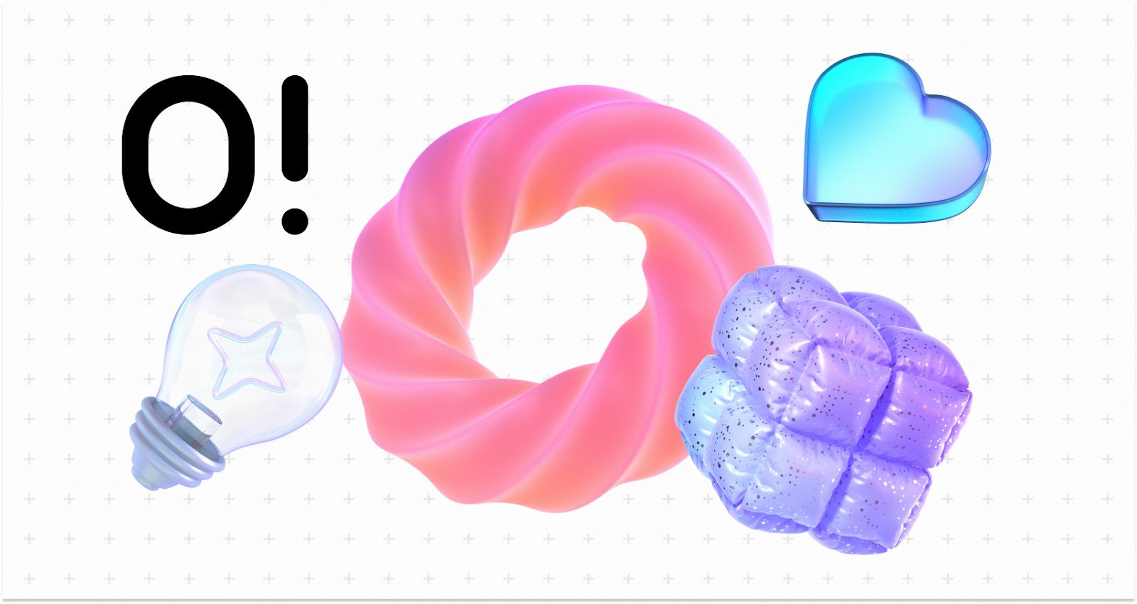
In a typical Ouch workflow, the designer doesn't hunt for random pretty pictures. They start by selecting a style that matches the app’s typography and color theory. With over 101 illustration styles available-ranging from "Business 3D" to minimal line graphics-designers avoid the generic "Corporate Memphis" look that plagues so many SaaS platforms.
Suppose a designer wants a 3D style to add depth to a flat interface. They browse the category specifically for UX flows. They download a "Welcome" scene for onboarding, a "Credit Card" object for the checkout flow, and a specific "No Connection" graphic for error states.
Because a single entity (Icons8) built the library rather than a marketplace of disparate contributors, the lighting on the 3D hands in the onboarding screen matches the 3D wallet in the settings menu.
Designers download these assets as FBX files (for 3D) or SVGs (for vector). If the brand color is a specific shade of teal, they don't have to accept the default blue. They open the files in their design tool or use the integrated Mega Creator to swap the hex codes before exporting. The result looks commissioned specifically for the app, despite coming from a library of 28,000+ business illustrations.
From an SEO perspective, optimized SVGs and lightweight Lottie files also improve page speed - a confirmed ranking factor. Unlike heavy raster images, properly exported vector assets contribute to faster load times and better Core Web Vitals performance.
sbb-itb-b8bc310
Scenario 2: The Content Marketing Engine
Marketing teams face a different challenge: volume and speed. A content manager running a blog and newsletter needs high-quality visuals daily. Relying on a design team for every blog header creates a bottleneck.
Here, the workflow shifts to Ouch’s modular capabilities. Picture a marketer writing an article about remote work technology. They search the "Technology" category, which houses over 23,000 assets. They find a style they like, but the composition isn't quite right. Maybe the character holds a phone, but the article is about laptops.
They don't settle. Using the Mega Creator integration, they select the base illustration but swap the "phone" object for a "laptop" object from the same style family. They might also rearrange the background elements to fit a wide banner format rather than a square social post.
This flexibility is particularly valuable for SEO-driven content teams producing pillar pages, comparison articles, and long-form guides. Unique visual compositions reduce the risk of duplicate-looking content and support image search visibility when paired with descriptive alt text and structured data.
For the newsletter, they need something lighter to break up text. They search for "searchable objects" rather than full scenes. They pull isolated vector elements-a cloud, a Wi-Fi symbol, a coffee cup-all in the same sketchy style used in the header.
Finally, to boost engagement in the email, they opt for motion. Instead of a static PNG, they download a GIF or a Lottie JSON file of a character typing. This adds visual delight without heavy code overhead. The marketer accomplishes this in roughly 20 minutes, bypassing the design department entirely while keeping the brand visual language intact.
A Developer’s Morning: Quick Implementation
Tools need to fit easily into a non-designer's day. Here is what a typical interaction looks like for a frontend developer.
It’s 10:00 AM. The developer is building a "Success" modal for a form submission. No designer is assigned to this specific ticket. They open the Pichon desktop app, which syncs with the Ouch library. They keep their code editor open on one side of the screen and Pichon on the other.
They search for "check mark" or "success" within the specific style used elsewhere in the app. They find an animated version. Instead of downloading, unzipping, and importing, they simply drag the Lottie JSON file directly from the Pichon app into their project’s asset folder. They copy the file path into the code. The animation works immediately. The whole process takes less than two minutes.
Comparison: Ouch vs. The Alternatives
The market for vector art and clipart is crowded. Here is how Ouch stacks up against common alternatives:
Ouch vs. Freepik
Freepik is a massive marketplace. The volume is higher, but the consistency suffers. Since Freepik relies on thousands of different contributors, finding a "404 error" image that matches your "Contact Us" image is difficult. You often end up with slightly different stroke widths or character proportions. Ouch prioritizes consistent style packs. It works better for building systems rather than finding one-off images.
Ouch vs. unDraw
unDraw is the open-source darling of the tech world. It is free and supports color customization. The downside is ubiquity. Because it is free and easy, it is everywhere. Using unDraw risks making your product look like a template. Ouch offers significantly more stylistic variety (101+ styles vs. unDraw’s single aesthetic), creating more distinct branding.
Ouch vs. Custom Illustration
Custom work is the gold standard. It creates visual metaphors unique to your specific value proposition. But it is slow and expensive. Ouch bridges the gap by offering "Mega Creator" to edit scenes. While not truly custom, the ability to swap parts and recolor gets you 80% of the way there for 1% of the cost.
Limitations and When This Tool Is Not the Best Choice
Ouch solves the consistency problem better than most, but it has specific limitations.
Niche Metaphors: If your product deals with highly specific industrial machinery, rare medical procedures, or complex abstract concepts, you may struggle. You might find a generic "doctor," but not a "neurosurgeon performing a specific procedure." In these cases, custom art is unavoidable.
Licensing for Merch: Planning to print these illustrations on t-shirts or mugs for sale? The standard license won't cover you. You must contact Icons8 for specific licensing. This adds friction for e-commerce entrepreneurs compared to public domain assets.
The "Free" Trade-off: The free plan is generous but requires attribution. For a professional SaaS landing page, having "Icons8" links in the footer might not project the enterprise image you want. To remove the link and get the editable SVG/source files, you must upgrade to a paid plan.
Practical Tips for Realistic Usage
Follow these practices to avoid the "stock" look:
- Never Use Defaults: Even if the default colors look nice, change at least one primary color to match your brand palette. This small step hides the fact that you are using a library.
- Use Lottie: Static images are fine, but Lottie animations (JSON) are lightweight and scale infinitely. Use them for micro-interactions like button clicks or loading states to make the app feel premium.
- Mix Objects, Not Scenes: Instead of using a full pre-made scene (e.g., "People sitting at a desk"), download the individual objects (desk, person, plant) and arrange them differently. This creates a unique composition that no one else has.
- Stick to One Style: Temptation often leads designers to pick the "coolest" image for each page. Resist this. If you start with the "3D Business" style, do not switch to "Flat Vector" for the next page. Inconsistency kills trust.
Verdict
Can off-the-shelf libraries support a coherent brand system?
Yes, but only if the library is designed for it. Ouch succeeds because it treats illustrations as UI components rather than standalone art pieces. By offering massive coverage across specific styles and providing the tools to edit and animate them, it helps teams build a visual language that feels intentional. It won't replace the storytelling capability of a talented custom illustrator, but it is likely the most efficient route for startups and agile teams to look professional without the overhead.