In today's mobile-first world, optimizing your website for mobile devices is crucial for search engine visibility and user engagement. Here are the five key UX elements that will boost your mobile SEO strategy in 2024:
-
Simplify Navigation
- Keep navigation minimal with 5-7 main options
- Use familiar patterns like hamburger menus
- Optimize for thumb reach and gesture-based navigation
- Optimize Page Speed
-
Create SEO-friendly Layouts
- Use clear content structure with headings
- Balance visual elements like images and videos
- Implement intuitive navigation and prominent CTAs
- Adopt responsive and mobile-first design
-
Ensure Mobile Responsiveness
- Use flexible layouts with CSS media queries
- Optimize images and media for mobile devices
- Prioritize mobile-friendly navigation patterns
- Design for touch-friendly interactions
- Test and optimize performance on mobile devices
-
Focus on Simple, Intuitive Design
- Streamline navigation with hamburger menus
- Organize content with visual hierarchy
- Design for mobile gestures like tapping and swiping
- Ensure interactive elements are finger-friendly
Related video from YouTube
1. Simplify Navigation
Simplifying your website's navigation is crucial for providing a seamless mobile user experience and boosting SEO. A well-designed navigation system can improve usability, reduce bounce rates, and signal to search engines that your site is optimized for mobile users.
Key Principles
To create an effective mobile navigation, follow these key principles:
| Principle | Description |
|---|---|
| Keep it minimal | Limit navigation options to prioritize the most important pages and features. |
| Use familiar patterns | Stick to standard navigation patterns, such as the hamburger menu or bottom navigation bar, to leverage existing mental models. |
| Optimize for thumb reach | Place frequently accessed elements within the "thumb zone" for comfortable and effortless interaction. |
| Implement gesture-based navigation | Incorporate intuitive gestures like swiping and scrolling to enhance the navigation experience. |
2. Optimize Page Speed
Page speed is crucial for mobile user experience and SEO. Slow loading times lead to higher bounce rates, frustrating users and negatively impacting search rankings. Here are some effective techniques to optimize page speed on mobile:
Image Optimization
| Technique | Description |
|---|---|
| Compress images | Use tools like TinyPNG or Imagify to reduce file sizes without sacrificing quality. |
| Lazy loading | Defer loading of images until they're needed. |
| WebP format | Use WebP for better compression. |
Code Optimization
| Technique | Description |
|---|---|
| Minify files | Remove unnecessary whitespace and comments from HTML, CSS, and JavaScript files. |
| Gzip compression | Reduce the amount of data transferred. |
Browser Caching
Browser caching allows frequently accessed resources to be stored locally on the user's device, reducing the need to download them repeatedly. Implement browser caching for static assets like CSS, JavaScript, and images to improve load times for returning visitors.
Content Delivery Network (CDN)
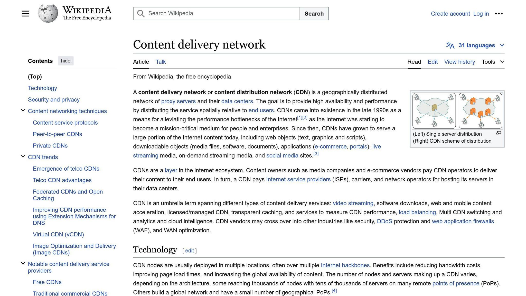
A CDN distributes your website's content across multiple servers worldwide, ensuring that users can access it from the closest server. This reduces latency and improves load times, especially for users in remote locations.
Prioritize Above-the-Fold Content
Optimize your website to load the above-the-fold content (the portion visible without scrolling) as quickly as possible. This can be achieved through techniques like:
- Inlining critical CSS
- Deferring non-critical scripts
- Optimizing the critical rendering path
3. Utilize UX Design to Create SEO-friendly Layouts
Creating user-friendly layouts is crucial for both enhancing the user experience and improving search engine optimization. Here are some key UX design principles to incorporate into your mobile layouts:
Clear Content Structure
Use headings (H1, H2, H3, etc.) to establish a logical hierarchy and structure your content in a scannable format. This makes it easier for users to quickly grasp the main topics and find relevant information. Search engines also prioritize well-structured content.
Balanced Use of Visual Elements
Incorporate visual elements like images, videos, and infographics to break up text and enhance the overall user experience. However, ensure these elements are optimized for mobile devices and have descriptive alt text for better accessibility and SEO.
| Visual Element | Optimization Techniques |
|---|---|
| Images | Compress file sizes, use responsive images, add alt text |
| Videos | Use HTML5 video players, provide video transcripts |
| Infographics | Ensure legibility on small screens, provide text alternatives |
Intuitive Navigation
Implement a simple and intuitive navigation menu that allows users to easily navigate your site on mobile devices. Prioritize essential links and consider using a hamburger menu or other mobile-friendly navigation patterns.
Prominent Calls-to-Action (CTAs)
Design prominent CTAs that are easily tappable on mobile devices. Use contrasting colors, whitespace, and clear messaging to guide users towards desired actions, such as making a purchase or subscribing to a newsletter.
Responsive and Mobile-First Design
Adopt a responsive or mobile-first design approach to ensure your website adapts seamlessly to different screen sizes and device orientations. This enhances the user experience and improves search engine visibility for mobile users.
sbb-itb-b8bc310
4. Ensure Mobile Responsiveness
Mobile responsiveness is crucial for providing an optimal user experience across various devices and screen sizes. A responsive website automatically adjusts its layout, content, and functionality to fit the user's device, whether it's a desktop, tablet, or smartphone. This ensures that your website is easily accessible and navigable for mobile users, which is essential for boosting your mobile SEO performance.
Google has been prioritizing mobile-first indexing since 2018, meaning that the search engine primarily uses the mobile version of a website for indexing and ranking purposes. As a result, having a responsive website is no longer just a nice-to-have feature; it's a necessity for achieving better search engine visibility and rankings.
Here are some key considerations for ensuring mobile responsiveness:
Flexible Layout and Design
Use CSS media queries to define breakpoints and adjust the layout accordingly. This may involve rearranging elements, resizing fonts, or hiding/showing content based on the device's screen size.
Optimize Images and Media
Ensure that all images, videos, and other media elements are optimized for mobile devices. Use responsive images that adjust their size and resolution based on the device's capabilities. Compress media files to reduce page load times and improve overall performance.
Prioritize Mobile Navigation
Implement a hamburger menu, accordion menus, or other mobile-friendly navigation patterns that allow users to easily access the most important sections of your website.
Touch-Friendly Interactions
Design your website with touch-friendly interactions in mind. Ensure that buttons, links, and other interactive elements are large enough and spaced appropriately for easy tapping on mobile devices.
Test and Optimize Performance
Regularly test your website's performance on various mobile devices and screen sizes. Use tools like Google's Mobile-Friendly Test and PageSpeed Insights to identify and address any issues related to mobile responsiveness, page load times, or other performance metrics.
| Mobile Responsiveness Checklist | Description |
|---|---|
| Flexible layout and design | Use CSS media queries to adjust layout based on device screen size |
| Optimize images and media | Use responsive images and compress media files for better performance |
| Prioritize mobile navigation | Implement mobile-friendly navigation patterns |
| Touch-friendly interactions | Design for easy tapping on mobile devices |
| Test and optimize performance | Regularly test and address performance issues on mobile devices |
5. Focus on Simple, Intuitive Design
Designing a mobile user experience that boosts SEO requires simplicity and intuitiveness. A clean, straightforward interface allows users to easily navigate and consume content, reducing bounce rates and improving engagement metrics that influence search rankings.
Streamline Navigation
Simplify your mobile site's navigation by:
- Using a hamburger menu or other condensed menu styles to save screen space
- Limiting main navigation items to 5-7 essential categories
- Utilizing dropdown menus or accordions for subcategories
- Ensuring navigation labels are clear and concise
Organize Content
Structure your content with a clear visual hierarchy that guides users' attention:
| Content Element | Guideline |
|---|---|
| Headings | Use to distinguish content sections |
| Spacing | Use to separate content sections |
| Typography | Use to highlight key information |
| Calls-to-Action | Highlight to guide users' attention |
Design for Mobile Gestures
Optimize for mobile gestures like tapping, swiping, and scrolling:
| Gesture | Application |
|---|---|
| Tap | Activate links, buttons, menus |
| Swipe | Navigate between pages or screens |
| Scroll | Consume content vertically |
- Ensure interactive elements are properly sized for fingers
- Use familiar gestures consistently throughout the experience
UX Design for Better Mobile SEO
Mobile user experience (UX) plays a crucial role in search engine optimization (SEO). A well-designed mobile UX can improve engagement metrics, such as bounce rate, dwell time, and click-through rate, which are key ranking factors for search engines like Google.
Prioritize Mobile-First Design
With most web traffic coming from mobile devices, it's essential to design and develop websites with mobile as the primary focus. This ensures that content, navigation, and functionality are optimized for smaller screens and touch-based interactions.
By prioritizing mobile-first design, you can:
- Improve Page Load Times: Optimize for mobile to reduce page weight, minimize render-blocking resources, and leverage techniques like lazy loading.
- Enhance Content Readability: Focus on clear, concise, and scannable content that improves the user experience and aligns with search engine preferences.
- Streamline Navigation: Design a well-structured mobile navigation system to reduce friction and improve the user journey.
Leverage Responsive Design
Responsive design is key to a mobile-friendly UX. By creating a website that adapts to different screen sizes and device orientations, you can ensure a consistent and optimal experience across various devices.
Responsive design principles, such as fluid grids and flexible images, allow your website to automatically adjust its layout and user interface elements based on the user's device and screen size.
Optimize for Mobile Interactions
Mobile devices introduce unique interaction patterns, such as touch gestures and voice input. To create a truly mobile-optimized UX, design with these interactions in mind.
| Mobile Interaction | Design Consideration |
|---|---|
| Touch-Friendly Design | Ensure interactive elements are appropriately sized and spaced for touch interactions. |
| Voice Search Optimization | Optimize content for voice search queries using natural language and concise answers. |
| Contextual Awareness | Leverage device capabilities and location data to provide personalized and relevant experiences. |
Conclusion
To achieve optimal website performance and higher search rankings, it's crucial to align mobile UX design with SEO strategies. The five key UX elements discussed - simplifying navigation, optimizing page speed, utilizing SEO-friendly layouts, ensuring mobile responsiveness, and focusing on intuitive design - can significantly boost mobile SEO in 2024 and beyond.
Prioritizing a seamless and engaging mobile experience, businesses can improve user engagement metrics like bounce rate, dwell time, and click-through rate, which are essential ranking factors for search engines. A well-designed mobile UX not only enhances the user experience but also signals to search engines that your website is mobile-friendly and deserving of higher visibility.
Why Mobile UX Matters
| Reason | Impact |
|---|---|
| Improves user engagement | Boosts search engine rankings |
| Enhances user experience | Increases website visibility |
| Signals mobile-friendliness | Improves search engine trust |
As mobile traffic continues to dominate the digital landscape, investing in mobile-first design, responsive layouts, and optimized mobile interactions is essential for businesses aiming to stay competitive and rank higher in search results.